
In July 2026, the Center for Inclusive Mobility Environments at Michigan University published the Public Transit Accessibility Dashboard. The dashboard ranked 85 cities and 100 transit authorities from across the country, showing which cities are leading the way for accessible transit and where there is still work to do.
The dashboard assessed the top 100 federally funded public transit systems in the US, accounting for 89% of all passenger miles travelled. In order to assess these systems, the dashboard looked at five dimensions of accessibility:
Accommodation measures how well a transit system communicates its accessibility features. Each system was scored out of 60 points broken down into 6 categories.
- Facility accessibility (20 points): proper signage, working elevators, hearing loops ramps, etc.
- Vehicle accessibility (10 points): details on boarding assistance and on-board features
- Inclusive policies (12 points): how easy is it to submit public feedback/contact an ADA coordinator
- Rider accommodations (9 points): how a rider can request specific help or whether the system provides regular equipment updates like broken elevators
- Paratransit services (6 points): clear information on qualifying for, scheduling, and using paratransit
- Website accessibility (3 points): how easily can the website be used by individuals with disabilities
Adjacency measures how many destinations in the community are reachable when using only public transit. The dashboard looked at every neighborhood within 1500 meters of transit routes and stops and used a specialized online tool to calculate how many destinations an older adult with a disability could reach within 30 minutes. Each block was then assigned a “reachable destination count” in which a higher number signified a greater variety of destination options.
Availability measures how often public transit shows up (frequency). This was measured as a daily average and was calculated with the official stop times reported by each transit system (therefore it may not reflect lived experience).
Affordability measures the financial cost of using public transit. The average fare per trip was determined by dividing the total fares by the total number of boardings, which includes discounted fares and free rides for transit users.
Acceptability is the fifth dimension that the dashboard reports data on, but it is not yet complete. The dashboard is actively looking for riders with disabilities and/or older adults to give feedback that will directly influence how transit systems are scored in the future, ensuring that the dashboard aids the disability community. Riders can share their lived experience here.
Categorized Dimensions group the transit systems and cities by sorting them into “High, Medium, or Low” categories based on the scores of the individual dimensions. Using the data from the individual dimensions and the categorized dimensions, the dashboard then gave each city/transit system an accessibility status and rank based on the dimensions rankings.The best accessibility status was “Optimal”, followed by “Sufficient”, “Fragmented”, and “Inadequate”.
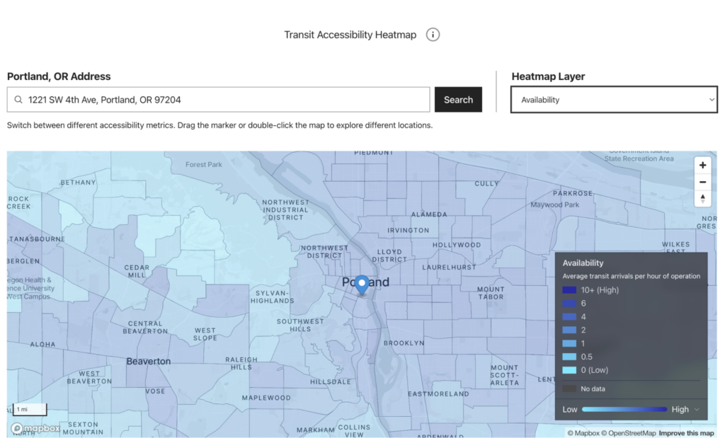
In each city/transit authority ranking there is a section for city level data, transit system level data, the characteristics of the city, an accessibility heatmap, a comparison tool which can be used with other cities, and suggestions for future improvements.
Example Ranking: Portland, Oregon ranks 1/85 for transit accessibility with a status of Sufficient.
- City Level Data shows that Portland ranks 26/85 for Adjacency, 22/85 for Affordability, 5/85 for Availability, and 23/85 for Accommodation
- Transit System Level Data shows that Portland has a transit system rank of 3/100 based on their TriMet data which is also displayed on the page
- Characteristics of Portland include
- Population of 1,768,682,
- An age distribution where 33.8% of the population is over 50 years old
- A race and ethnicity distribution where 65.4% of the population is white
- 13.1% of the population reports having a disability
- The Interactive Transit Accessibility Heat Map allows you to see the adjacency, affordability, availability, and accommodation rankings for specific areas – including individual streets and neighborhoods
Guides: Translating Data into Power
The guide provides seven “stops” to move from understanding the barriers surrounding accessible public transportation to leveraging the data to help drive system change. The “stops” include understanding the need for accessible public transit, understanding the measures of affordability, accommodation, adjacency, availability, and the composite measure, and finally translating the data into power.
The guide also provides specific sections with information on using the data in the dashboard in productive ways for community members and advocates, researchers, public transit system agencies, and policymakers.
Community members and advocates are invited to use the information in the dashboard to help with their community organizing efforts. It recommends organizing an accessible community meeting that seeks to ensure that everyone in the community is invited to the meeting and all voices are heard. It also recommends building power within the community through grassroots organizing, conversing with public transit system representatives, advocating at local government meetings, and sharing community members’ lived experiences and expertise as an advisory board member to a research group.
Researchers can use the dashboard as a source that brings together accessible data on public transit accessibility to support comparisons across systems and analysis over time, evaluations of interventions and policies, identification of inequities and structural patterns, and qualitative and community research. The dashboard includes many interactive visualizations, comparison tools, and raw downloadable data to help researchers conduct transparent, reproducible, and factual analysis at both the system and national levels.
Public transit system agencies can use the dashboard to help make informed decisions that improve transit access across communities. The dashboard recommends inviting a diverse group of community members to provide feedback on the system and to continue to transparently communicate and demonstrate follow-up through action items. The guide also suggests collaboration between researchers and policymakers to gather important data and transform it into meaningful policy initiatives and funding practices that can expand transit accessibility.
Policymakers can rely on the dashboard to help inform themselves of what accommodations look like in public transit systems and also how necessary they are for the community. Meetings with community members, researchers, and public transit system agencies independently can help to inform and encourage policymakers to prioritize transit accessibility in their work.